
Benchmark
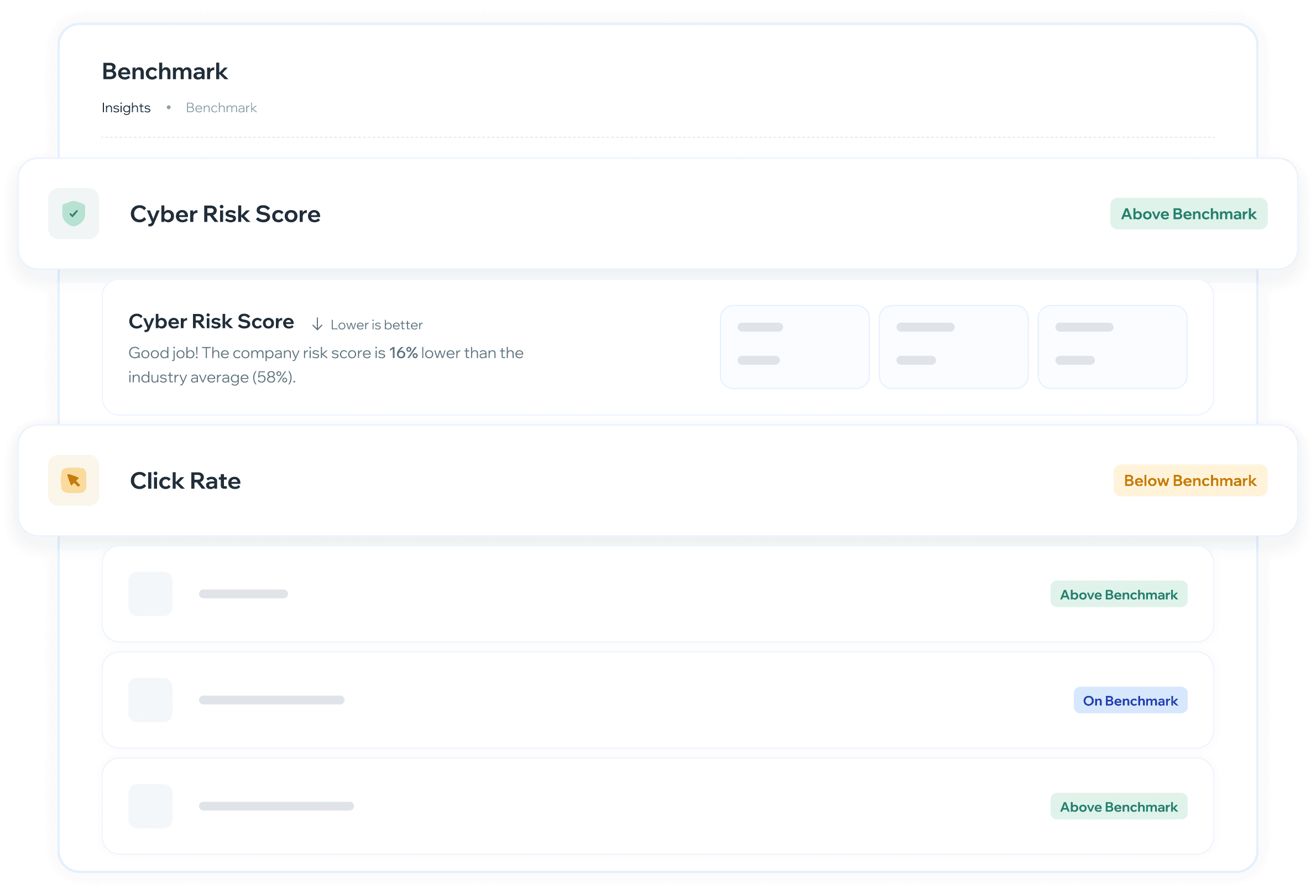
Vista comparativa del desempeño de concientización de tu organización contra el promedio de tu industria o el global de Whalemate, con seis KPIs, indicadores de estado y la brecha por métrica.
¿Para qué sirve?
Saber si la organización está por encima o por debajo del promedio de la industria en métricas clave de seguridad
Identificar en qué indicadores hay que mejorar y en cuáles la empresa ya está destacada
Comparar contra la industria que quieras, no solo contra la propia
Proveer contexto comparativo para justificar decisiones de inversión en programas de concientización
Llevarte el tablero como reporte para compartirlo con dirección o adjuntarlo a una auditoría
¿Cuándo usarlo?
Después de un ciclo de campañas — para evaluar si las acciones tomadas mejoraron las métricas respecto al promedio
Al definir prioridades del próximo período — para decidir en qué métricas enfocar los esfuerzos
¿Cómo se usa?
Navegación: Insights → Benchmark
Ver el resumen de benchmark
Al ingresar se muestra el Resumen de benchmark con todas las métricas comparadas contra la referencia seleccionada. Cada métrica aparece primero como una fila colapsada con su nombre y un badge de estado. Al hacer clic se expande mostrando el detalle completo.
Si tu organización todavía no tiene actividad suficiente, la pantalla muestra «No hay datos de benchmark disponibles» en lugar de la lista.
Seleccionar el período
Usa el selector de período para elegir el rango de tiempo que quieres analizar. Las opciones disponibles son 3 meses, 6 meses, 1 año y Todo el tiempo.
Al cambiar el período, tanto los KPIs propios de la organización como los valores de benchmark se actualizan para ese mismo rango.
Si tu organización empezó a usar la plataforma después del inicio del período elegido, el selector aclara desde cuándo hay información con el aviso «Datos disponibles desde» y la fecha. El cálculo usa solo ese tramo, así que un período de 1 año en una empresa de tres meses no está comparando doce meses de datos.
Elegir la referencia de comparación
El selector de referencia tiene dos opciones y eliges una a la vez: Industria —el promedio de tu sector, y el botón muestra el nombre de tu industria— o Global, el promedio de todas las organizaciones de Whalemate. La propia organización siempre se excluye del cálculo del promedio.
Si no hay suficientes organizaciones de tu sector para armar un grupo comparable confiable, la pantalla te avisa con un cartel: «Comparación global activa». En ese caso los números que estás viendo son contra el promedio global, no contra tu industria, aunque hayas elegido Industria.
Comparar contra otra industria
Al lado del selector de referencia está el selector de industria. Por defecto muestra la industria de tu perfil; si lo abres, podés elegir otra y todos los indicadores se recalculan contra ese sector.
Arriba de la lista aparece la opción «Tu industria (…)», que es la que se aplica por defecto y a la que volvés cuando quieras.
Debajo van las demás industrias, ordenadas de la que tiene más empresas a la que tiene menos.
Al elegir una a mano aparece un aviso informativo que aclara contra qué industria estás comparando.
Por qué no están todas las industrias en la lista. El promedio de un grupo muy chico no dice nada útil y además dejaría expuesta a cada empresa que lo compone. El desplegable solo ofrece las industrias que tienen suficientes empresas para armar un promedio confiable.
Si tu propia industria todavía no llegó a ese mínimo, te lo avisamos en pantalla y comparamos contra el promedio general de la plataforma mientras tanto. El selector sigue usable para explorar otras.
Con el alcance en Global, el selector de industria queda deshabilitado: la comparación es contra toda la plataforma y la industria no interviene.
Compartir la vista que armaste
El período, el alcance y la industria quedan guardados en la dirección del navegador, así que podés copiarla y mandarla.
Con un detalle pensado a propósito: si no cambiaste la industria a mano, quien abra tu link va a ver la comparación de su industria, no la tuya. El link fija una industria solo si elegiste una. Así un link «mirá el Benchmark» sirve para cualquiera, y un link «mirá cómo venimos contra Banking» muestra exactamente eso.
Si abrís un link con una industria que no se puede comparar, la pantalla te avisa con «Esa industria no se puede comparar» y te ofrece un botón Restablecer filtros dentro del mismo aviso.
Exportar el tablero como reporte
El botón Exportar de la cabecera genera un reporte con la comparación de tu empresa, en tres formatos:
PDF — el reporte completo con portada. Es el formato para mandar por correo, adjuntar a un comité o guardar como evidencia de una auditoría.
PNG / JPEG — una imagen del mismo reporte, para pegar en una presentación.
El reporte incluye la portada con el logo, el nombre de tu empresa y el mes; la fecha de generación y quién lo exportó; los filtros con los que se generó —el período y contra quién se comparó—; y cada KPI con su detalle: tu valor, el promedio del benchmark, la diferencia y la lectura de qué significa. Las tarjetas salen abiertas, no hace falta desplegarlas antes de exportar.
El archivo se llama
benchmarking_<fecha>_<industria>.pdf, así que si guardás varios quedan ordenados por fecha y se distingue contra qué industria se comparó. Cuando la comparación es global, el nombre usaglobal.
El reporte se arma con lo que la pantalla está mostrando en ese momento: si cambiás el período o la industria, exportá de nuevo. Y si un KPI está oculto en pantalla, tampoco aparece en el archivo.
Si tu empresa todavía no tiene actividad medida, el reporte se puede exportar igual y cada indicador va a decir «Sin datos». Sirve para dejar constancia del punto de partida.
Leer el estado de cada métrica
Cada fila muestra un badge con uno de cuatro estados:
Sobre el benchmark (verde) — la organización supera el promedio de referencia
Bajo benchmark (amarillo) — la organización está por debajo del promedio
En benchmark (azul) — la organización está en línea con el promedio
Sin datos (gris) — todavía no hay información suficiente para calcular esa métrica o su comparación. No significa que el resultado sea malo: significa que no hay resultado.
Leer el detalle expandido de cada métrica
Al expandir una métrica se muestran tres valores: Actual, el valor real de la organización; Prom. industria, el promedio de la referencia seleccionada; y Delta, la diferencia entre ambos, positiva o negativa.
Cuando falta información, cada uno de los tres puede mostrar Sin datos, y en lugar de la lectura comparativa aparece «Todavía no hay datos suficientes para comparar este KPI.»
Debajo de los valores aparece una descripción automática con el resultado y una evaluación contextual (ej: "Buen trabajo" o "Área de mejora"). Cada métrica también indica si el criterio es Mayor es mejor o Menor es mejor, para interpretar correctamente el delta.
Métricas disponibles
En pantalla ves cinco:
Cyber Risk Score ↓ Menor es mejor: puntaje de riesgo general de la organización
Tasa de reporte ↑ Mayor es mejor: % de empleados que reportaron simulaciones correctamente
Tasa de clic ↓ Menor es mejor: % de empleados que clicaron en simulaciones de phishing
Finalización de entrenamiento ↑ Mayor es mejor: % de empleados que completaron cursos
Tasa de recurrencia ↓ Menor es mejor: % de empleados reincidentes
Finalización de Learning Paths —el % de Rutas de Aprendizaje completadas, contando cada Ruta como un programa entero y no como sus cursos por separado— todavía no se muestra. Está calculada pero pendiente de que se aplique su diseño, así que por ahora no aparece en la pantalla ni en el reporte exportado.
Cómo se cuentan las dos métricas de finalización. Las dos se calculan al cierre del plazo: las asignaciones y las Rutas cuyo plazo todavía está vigente no se cuentan hasta que vencen, para evitar que la tasa aparezca artificialmente baja al inicio del período. La Finalización de entrenamiento incluye tanto cursos sueltos como cursos que forman parte de Learning Paths.
¿Cómo interpretar los resultados?
Cyber Risk Score bajo el promedio → señal positiva. La organización tiene menos riesgo que sus pares de industria. Si además viene bajando en el tiempo, el programa está funcionando.
Tasa de clic sobre el benchmark → los empleados están cayendo en simulaciones más que el promedio. Es el indicador más directo de vulnerabilidad y donde conviene enfocar las próximas campañas.
Tasa de reporte bajo el benchmark → los empleados no están reportando simulaciones sospechosas. Trabajar en cultura de reporte puede mejorar este número sin necesidad de más campañas.
Finalización de entrenamiento bajo el benchmark → hay empleados que no completan los cursos asignados. Revisar la asignación, la dificultad o la frecuencia de los cursos.
Delta negativo en métrica "Menor es mejor" → siempre es positivo. Significa que la organización está mejor que el promedio.
Varias métricas en «Sin datos» → antes de leerlo como un problema del programa, revisa el período: con poca historia o poca actividad, el benchmark no tiene con qué comparar.
¿Qué hacer según lo que ves?
Todas las métricas sobre el benchmark → mantener el ritmo y usar los resultados como evidencia de impacto
Una o dos métricas bajo el benchmark → priorizar esas métricas en el próximo ciclo. Ajustar el tipo de simulaciones o el contenido de los cursos según cuál esté fallando.
Mayoría bajo el benchmark → revisar la estrategia completa. Puede indicar que las campañas no tienen la frecuencia o variedad suficiente, o que la audiencia no está bien segmentada.
🔜 Filtrar además por tamaño de empresa está en la cola de trabajo. Por región o país no está previsto por ahora: casi todas las empresas de la plataforma están en la misma región, así que el filtro devolvería prácticamente el mismo grupo. Si alguna de las dos es prioritaria para tu organización, puedes solicitarla en roadmap.whalemate.com/roadmap.
❓ Preguntas frecuentes
¿Puedo comparar mi empresa contra una industria que no es la mía?
Sí, con el selector de industria de la cabecera. Elegís la que quieras y todos los indicadores se recalculan. Para volver, la primera opción de la lista es «Tu industria (…)».
No encuentro mi industria en el desplegable.
Es porque todavía no hay suficientes empresas de ese sector como para armar un promedio confiable. En ese caso la pantalla te lo avisa y compara contra el promedio general de la plataforma; el selector queda usable para explorar otras industrias.
Le mandé el link a un colega de otra empresa y ve otros números.
Es lo esperado. Si no cambiaste la industria a mano, el link no la fija: cada uno ve la comparación de su propia industria. Si querés que vea exactamente tu comparación, elegí la industria en el selector antes de copiar la dirección.
¿Cambiar la industria cambia mis propios números?
No. Tu valor Actual es siempre el mismo; lo que cambia es el promedio de referencia y, por lo tanto, el delta.
¿Cómo me llevo el benchmark a una reunión?
Con el botón Exportar de la cabecera: PDF para mandar o adjuntar, PNG o JPEG para pegar en una presentación. El archivo lleva la fecha, quién lo generó y los filtros aplicados, así que cuando circula se sabe de cuándo es y de dónde salió.
¿Contra qué se compara la organización si no hay suficientes empresas de su industria?
Contra el total de empresas de Whalemate, y la pantalla te lo avisa con el cartel «Comparación global activa». La propia organización siempre se excluye del promedio.
¿Alguien puede ver mis números?
No. De las otras empresas solo se ve el promedio del grupo, y solo de grupos que llegan al mínimo de empresas. En ningún momento se muestran datos de una empresa en particular, ni sus nombres.
¿Qué significa el Delta?
Es la diferencia entre el valor actual de la organización y el promedio de referencia. Un delta negativo en una métrica "Menor es mejor" (como Cyber Risk Score) es positivo, lo cual significa que la organización está mejor que el promedio.
Una métrica dice «Sin datos». ¿Está mal algo?
No. Significa que todavía no hay información suficiente para calcularla o para compararla: puede faltar actividad de tu organización en ese período, o puede no haber suficientes empresas de referencia. Prueba con un período más amplio.
¿Con qué frecuencia se actualizan los promedios de industria?
Los promedios de industria y el puntaje de cada organización se actualizan diariamente. Los datos son históricos, por lo que se puede ver la evolución en el tiempo.
¿Puedo ver el benchmark por departamento o grupo?
La vista actual muestra el benchmark a nivel organización. La segmentación por grupo estará disponible próximamente.
¿La Finalización de entrenamiento incluye los cursos que forman parte de un Learning Path?
Sí. La métrica considera tanto cursos independientes como cursos que forman parte de una Ruta de Aprendizaje.
💬 ¿Tienes feedback sobre esta funcionalidad o quieres solicitar mejoras? Háznoslo saber en roadmap.whalemate.com/roadmap